49-inch Wall-mounted Advertising Machine — A New Highlight for Large Beauty and Hairdressing Salons
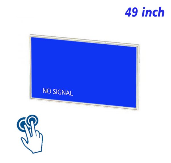
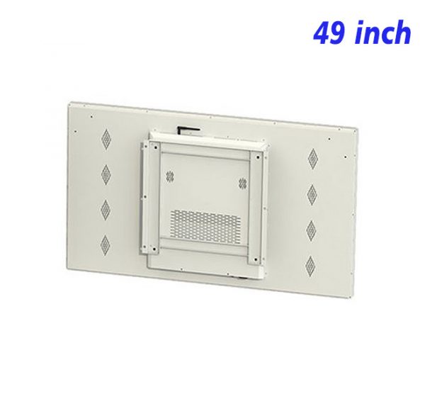
The application of the 49-inch wall-mounted advertising machine in large beauty and hairdressing salons enhances brand image and customer experience, becoming a bridge connecting beauty brands with consumers.
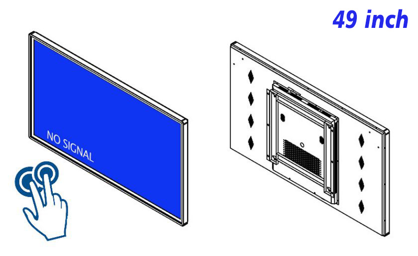
With the improvement of people’s living standards, investment in personal image has become increasingly important. For large beauty salons, standing out in a competitive market and enhancing brand image and service experience is particularly crucial. The 49-inch wall-mounted advertising machine, with its unique display effects and information dissemination capabilities, is gradually becoming a key element in enhancing the image and service level of beauty salons.
49-inch HD Wall-mounted Advertising Machine — Enhancing Brand Image
Installing a 49-inch HD wall-mounted advertising machine in large beauty salons not only showcases the salon’s service items, featured products, and promotional policies but also helps shape the salon’s professional image by playing brand stories, service philosophies, and customer reviews. This large-sized HD display device can attract customers’ attention, allowing them to gain a comprehensive and profound understanding of the beauty and hairdressing salon in a short time.
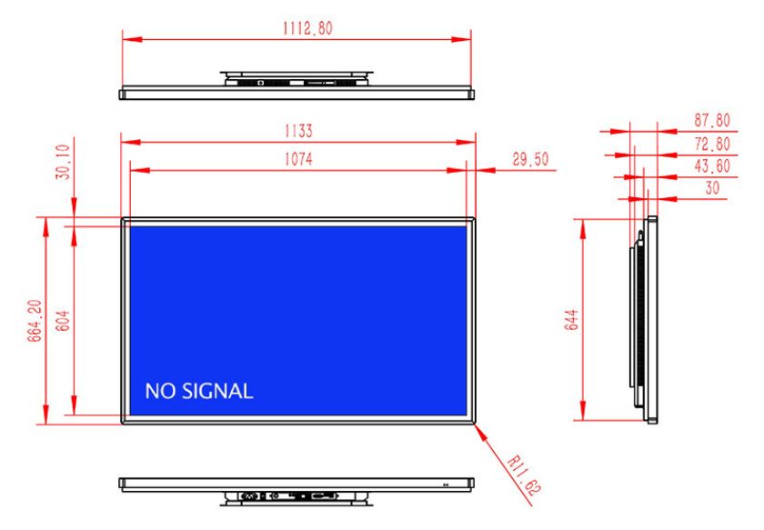
LCD Screen Promotional Display Wall-Mounted – Providing an Immersive Experience
The LCD screen promotional display wall-mounted offers customers an immersive experience with its HD display effect and wide field of view. Whether showcasing the process demonstrations of beauty and hairdressing services or displaying the effects of beauty products on different skin types, everything can be vividly presented before the customers. This immersive feeling not only stimulates customers’ interest but also deepens their understanding of the service offerings.
HD Wall-Mounted Advertising All-in-One Machine – Optimizing Customer Service Processes
For large beauty and hairdressing salons, enhancing the customer service experience is crucial. The HD wall-mounted advertising all-in-one machine can be used to play service process explanations, appointment reminders, and other content, helping customers understand the service process and reducing anxiety and confusion during the waiting period. In addition, these devices can also display customer reviews, member discounts, and other information to enhance customer confidence and satisfaction.
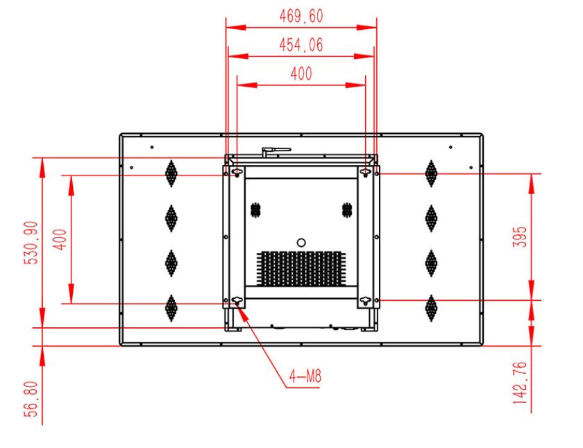
49-Inch Wall-Mounted Advertising Machine – Strengthening Product Promotion
To better promote beauty and hairdressing services and related products, the 49-inch wall-mounted advertising machine can play detailed service introduction videos, including the professional skills of beauticians and detailed displays of the service process. This intuitive and vivid display method allows customers to gain a more comprehensive understanding of service features, thereby stimulating their desire to purchase. At the same time, these devices can also be used to display limited-time offers, new service items, and other information to further promote sales.
The 49-inch wall-mounted advertising machine provides an efficient information dissemination tool for large beauty and hairdressing salons, not only enhancing brand image and service quality but also effectively promoting new products and services. With the advancement of technology and changes in market demand, the 49-inch wall-mounted advertising machine will play an increasingly important role in the beauty and hairdressing industry in the future. Beauty and hairdressing salons should fully utilize the advantages of this medium, continuously innovate display methods and service models, and provide customers with a more convenient and efficient beauty and hairdressing experience.
Reviews
There are no reviews yet.