
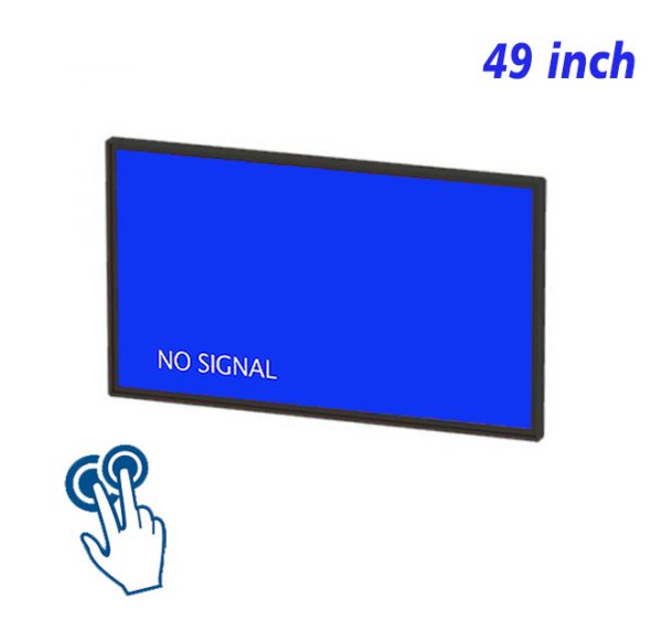
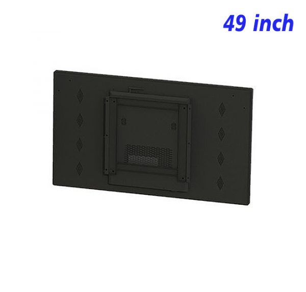
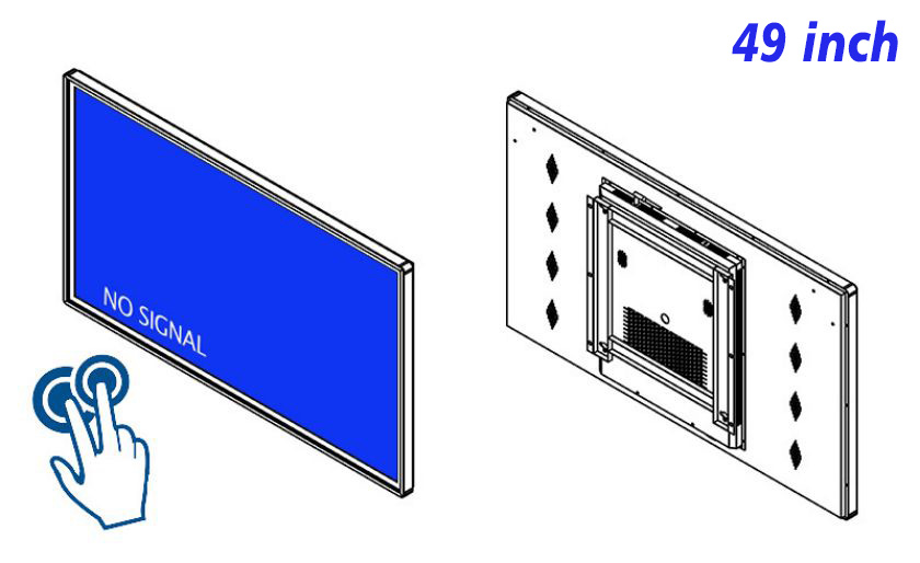
Service information is often available but scattered among posters, documents and separate counters. A 49 inch commercial IR touch display gathers common services, process explanations, opening times and location guidance into one interactive view. Finding information becomes a clear sequence of choices instead of a search through disconnected materials.
Use Service Names That Are Already Familiar
Home-page categories should reflect what a person wants to do, such as Find a Service, View the Process, or Location and Hours, rather than copying internal department names. Action-based wording reduces interpretation and helps a first-time user recognize the next step. Icons can assist recognition on a commercial IR touch screen, but the accompanying words still need to state the purpose clearly.
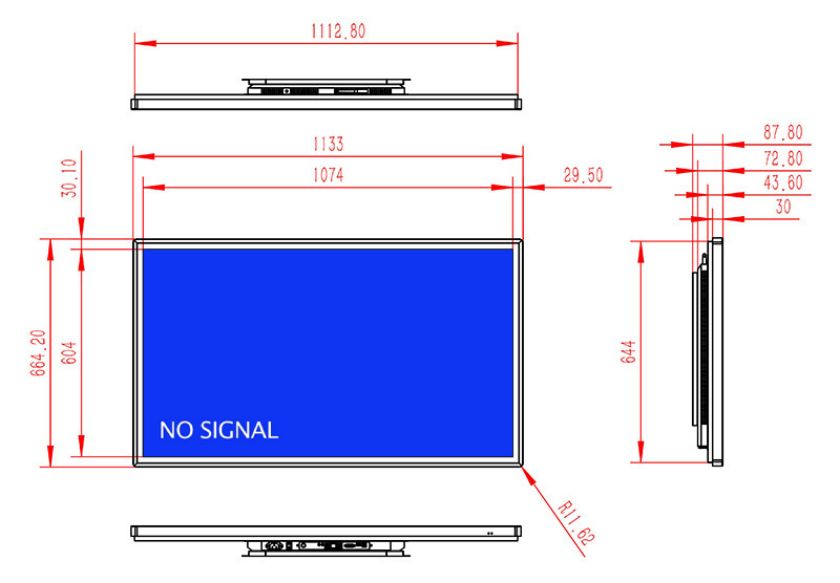
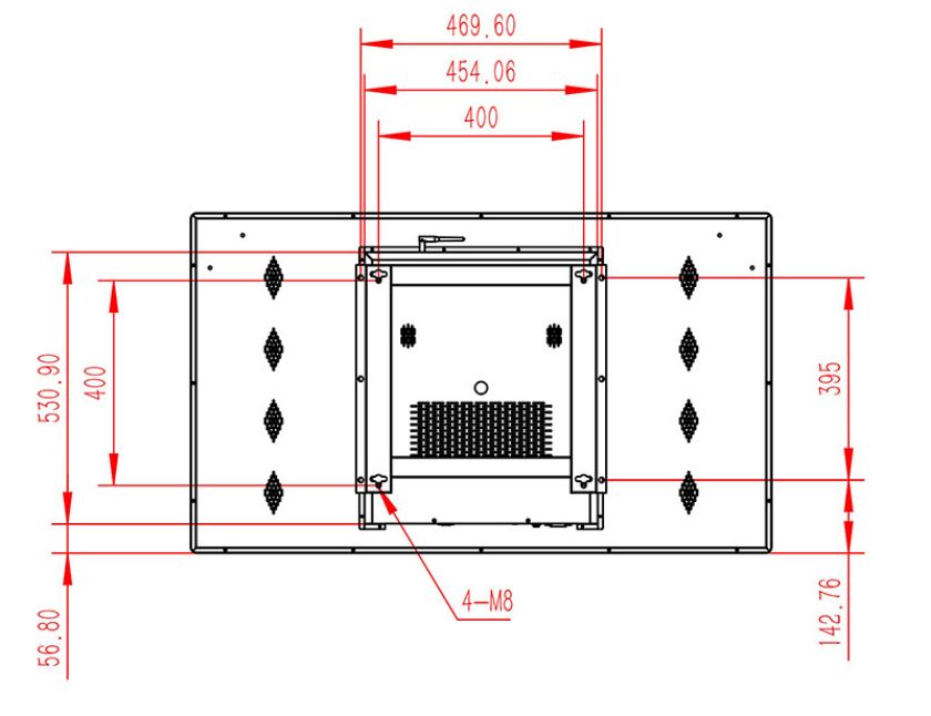
The 49-inch viewing area of a 49 inch commercial IR touch display can retain main categories, notices and a return entry at the same time. It does not need to fill the first page with details. Giving direction first and explaining conditions, steps or required information on the next level produces a calmer browsing experience.
Break a Complicated Service Into Small Confirmable Steps
A longer process can use a progress indicator, numbered pages or question-based navigation. Each step should ask for only one decision and should allow a return for correction. Supporting explanations belong beside the relevant choice rather than collected at the bottom of the page. A service selection display can also provide a short summary at the end to confirm what has been reviewed.
When different services are presented on the 49 inch commercial IR touch display, the general page logic may remain consistent, but the visual emphasis should suit the material. Time information needs strong visibility, location guidance needs a map, processes work well as numbered steps, and functional differences are clearer in an aligned comparison.
Important Notices Must Not Disrupt Normal Navigation
Temporary changes, maintenance reminders or revised hours can appear at the top of the home page or inside a separate notice area with an effective date. Pop-up messages should be reserved for genuinely important information and must be easy to close. A permanently highlighted notice gradually loses its impact and may interfere with frequently used controls.
When no one is interacting, the 49 inch commercial IR touch display can show a concise information view and return to the service home page as soon as it is touched. Standby and interactive content should share the same visual style, making the transition feel intentional rather than abrupt.
Update One Item, Then Check the Entire Route
When one service changes, only the relevant pages may need editing, but the complete route should still be tested from the home page. The entry, explanation, links and return state must all remain correct. Outdated pages and inactive buttons should be removed together so the interface never offers a route that ends without useful information.
Routine care includes cleaning the touch surface, checking page loading and confirming the default home view. With accurate content and stable navigation, the 49 inch commercial IR touch display becomes a dependable wall-mounted information point instead of a temporary presentation tool.
The wording inside each process should remain as practical as the home-page labels. Short statements can explain what the service covers, what happens next and where related information is located. If a choice requires a longer condition, the essential point should remain beside the control while the full explanation opens only when requested. This keeps the main route readable without withholding useful context. Related hours and location details should stay close enough to the service name that their relationship remains obvious during a quick review.
Maps, hours and process pages can also link to one another where the relationship is direct. A service detail may open its location, and a location page may return to the relevant service description. These connections reduce repeated searching, but they should never create a circular route or remove the clear path back to the home page. This keeps related information visually and functionally connected.
Service Navigation FAQ
Can several services share one interface?
Yes. Begin with a limited set of broad categories and reveal related services in later layers. This preserves clear navigation while allowing the display to contain a wider range of information.
How should service differences be presented?
Use the same comparison points for each service, such as suitable situation, timing, steps and functions. Aligned information is easier to understand than several long paragraphs.
Where should a temporary notice appear?
Place it where it remains visible without covering a primary entry, and always show a clear time period. The large screen of a 49 inch commercial IR touch display provides enough room to keep notices and navigation visually separate.
Bring Your Digital Content to Life
Use this commercial display to present promotions, product stories, menus, guidance and brand messages in an engaging digital format. Contact the ZXTLCD sales team to explore the configuration that best matches your application.
Reviews
There are no reviews yet.