
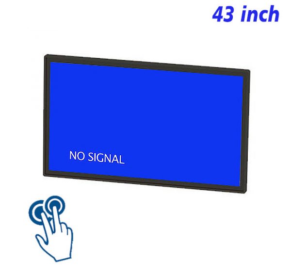
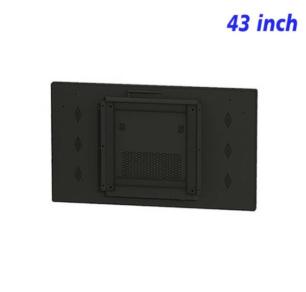
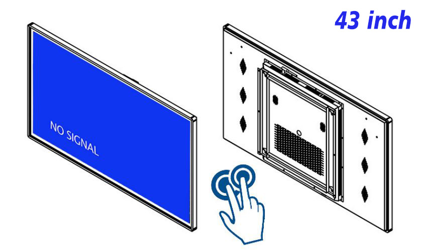
The value of a dashboard is not the number of figures it can hold, but how quickly it reveals a change that needs attention. A 43 inch interactive touch screen monitor can keep essential status, trends and alerts on its default view, then use touch to reveal supporting detail. Its 43-inch format is comfortable for close viewing and creates a clear information center on a limited wall area.
Decide What Deserves the Main Page First
Core status should receive the strongest visual weight, secondary indicators should be smaller, and detailed records can remain on a deeper layer. Every number needs a clear label and time range so that it does not appear without context. An interactive data dashboard can use card-based sections, but the number of cards must support fast understanding rather than fill available space.
The home page of a 43 inch interactive touch screen monitor should remain useful even when no one is touching it. Primary status and active alerts stay visible in the default state; interaction answers the next question instead of hiding information that should have been obvious from the beginning.
Every Color Must Keep the Same Meaning
Status colors such as green, amber and red need a consistent definition on every page. A color should not represent priority in one place and a different category elsewhere. Icons and written labels can reinforce the meaning so the information does not rely on color alone. A data visualization touch display also needs strong text-to-background contrast for both close and more distant viewing.
An alert on a 43 inch interactive touch screen monitor should look different from normal movement without leaving the entire dashboard in a permanently intense state. Once acknowledged, it may remain in the record or move to a lower visual priority instead of disappearing with no trace.
Move From Summary to Detail and Return to the Same Place
Touching a status card can open a trend, timeline, related image or short explanation. The detail view should retain the item name and a predictable return control. Returning to the dashboard should preserve the earlier position. This stable drill-down behavior makes exploration continuous and reduces accidental navigation.
A 43 inch interactive touch screen monitor can place a short-term trend beside the current state. Chart units, scales and time ranges must remain explicit, ensuring the visualization is informative rather than designed only for appearance.
When Data Changes, Check Whether Its Explanation Still Fits
A revised data source, indicator name or status threshold can affect more than the number itself. Headings, color rules, chart ranges and detail text all need review. The default page should include an honest data-unavailable state rather than continue showing an old value as if it were current. Periodic tests of touch entries and return paths also prevent individual detail pages from becoming isolated.
Through restrained information selection and consistent visual rules, a 43 inch interactive touch screen monitor can organize complicated conditions into a dependable commercial visual dashboard.
Relationships among indicators should be visible only where they support interpretation. A main status can sit beside one or two related measures, while less relevant figures remain in the detail layer. This prevents the dashboard from suggesting that every number has equal importance and helps the eye move from condition to cause in a deliberate order.
Labels should also explain whether a figure is current, cumulative or compared with an earlier period. A small difference in wording can change how a trend is understood, so units and time references need to remain close to the value. Touch can reveal a deeper explanation, but the summary should never depend on hidden context to make basic sense. Any comparison period should be named directly instead of being left for the viewer to infer. The context stays visible.
Regular review should include the quiet state as well as alerts. Normal conditions must remain readable and useful, rather than becoming an empty screen that only gains meaning when something changes. A balanced default view supports continuous monitoring without unnecessary visual pressure.
Dashboard Application Questions
How many indicators should appear on the home page?
The number should allow the most important condition to be identified quickly. Secondary indicators can be grouped or moved into detail instead of giving every number the same weight.
Which supporting information is suitable for touch access?
Trend charts, timelines, related records, images and explanations of a status are all useful choices for a deeper touch layer.
What should happen when the data cannot update?
Show the update time and a clear unavailable message instead of continuing to present potentially outdated status. A 43 inch interactive touch screen monitor should make the reliability of its information easy to judge.
Bring Your Digital Content to Life
Use this commercial display to present promotions, product stories, menus, guidance and brand messages in an engaging digital format. Contact the ZXTLCD sales team to explore the configuration that best matches your application.
Reviews
There are no reviews yet.