
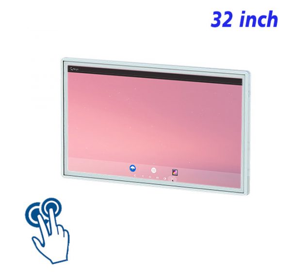
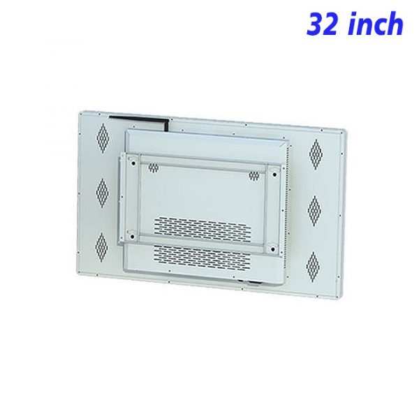
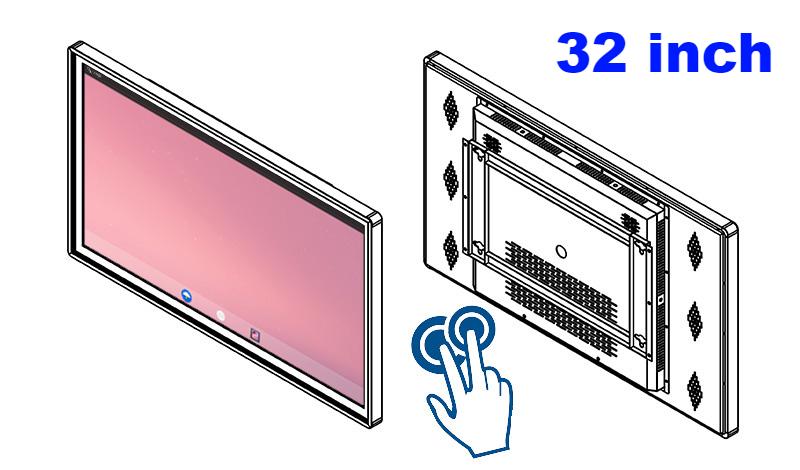
The 32 inch interactive Android touchscreen is designed around a simple idea: letting brand content unfold through interactive choices. In studios, tasting areas, craft shops, reception walls, and product experience zones, the screen can introduce a product, explain a service, highlight a timely message, or add movement to an otherwise static wall. The result feels useful and connected to the space rather than added simply for decoration.
Let the First Touch Reflect a Real Product Question
Introduce origin, materials, design thinking, or signature details before showing an offer. This is where the 32 inch interactive Android touchscreen can turn brief attention into a clear product or service message. The content should lead with the most useful fact, not a long introduction, so the reason to keep watching is visible straight away.
At this first contact point, a single strong image and a short line usually work harder than a crowded composition. Give the main idea enough time to register, then let supporting detail appear in the following scene. This pacing suits letting brand content unfold through interactive choices and makes the sequence easier to follow without sound. In this part of the presentation, that approach makes it easier to introduce origin, materials, design thinking, or signature details before showing an offer.
Reveal Features in Layers Instead of One Long Page
Let each scene answer one question instead of compressing everything into a poster. A clear composition gives each element a job and prevents decorative details from competing with the main message. The screen feels more confident when one visual leads and the wording supports it.
The layout should guide the eye in a natural order: image first, headline second, supporting detail last. Comfortable spacing and controlled contrast help the message remain clear at the expected viewing distance, while a consistent type style keeps changing scenes visually related. In this part of the presentation, that approach makes it easier to let each scene answer one question instead of compressing everything into a poster.
Comparisons Work Better With a Stable Layout
In this setting, the priority is to use photography and restrained typography to support the feeling of the space. That decision links the media to the physical environment and makes the presentation easier to understand during a normal walk, pause, or service moment.
Position also changes how the message is understood. Media beside a related object can explain it; media near an entrance can introduce what comes next. By connecting the screen with its immediate surroundings, letting brand content unfold through interactive choices becomes part of the experience rather than an isolated interactive moment. In this part of the presentation, that approach makes it easier to use photography and restrained typography to support the feeling of the space.
Use Images to Support Choices, Not Distract From Them
A practical role for the 32 inch interactive Android touchscreen is to position media near the related product, service, or experience. Instead of repeating the same scene all day, the playlist can change emphasis while keeping one recognizable visual direction.
Fresh content does not require a completely new design every time. Reusable layouts can hold new images, headlines, dates, or highlights while preserving familiar colours and spacing. This keeps updates efficient and prevents short campaigns from looking disconnected from the rest of the presentation. In this part of the presentation, that approach makes it easier to position media near the related product, service, or experience.
Always Provide a Clear Way Back
The practical goal is simple: retain core identity while refreshing imagery, featured details, and topical messages. Content should feel comfortable at the real viewing distance, with enough time to read and no unnecessary movement competing for attention.
Everyday quality depends on small checks: clean the visible surface, confirm that the correct sequence is playing, and remove information that is no longer current. These habits protect readability and help letting brand content unfold through interactive choices remain convincing long after the first campaign goes live. In this part of the presentation, that approach makes it easier to retain core identity while refreshing imagery, featured details, and topical messages.
Keep Product Information Current and Easy to Review
Rather than adding more messages, focus on how to check visible cleanliness, playback continuity, and the accuracy of every displayed statement. A smaller number of well-ordered scenes usually creates a stronger impression than a long sequence with several competing ideas.
Browsing Products on a 32 inch interactive Android touchscreen
For letting brand content unfold through interactive choices, product imagery, short demonstrations, comparisons, schedules, service information, and timely reminders can all play a part, but they should not appear with equal weight. A useful playlist gives each scene one purpose and lets the sequence build naturally from attention to understanding.
When preparing media for letting brand content unfold through interactive choices, preview the finished work where the screen will actually be viewed. Check text size, crop, contrast, timing, and whether the meaning survives without audio. Keep a simple fallback scene ready so the wall still looks intentional when a temporary interactive presentation ends.
Questions About Interactive Product Browsing
What makes a strong brand-story sequence?
A clear beginning, a few memorable details, consistent imagery, and a concise closing message.
Can the content focus on craftsmanship?
Yes. Close-up imagery, step-by-step scenes, and short captions can make craftsmanship easier to appreciate.
How many ideas should appear in one scene?
Usually one main idea, supported by only the details needed to understand it.
Can seasonal content retain the same identity?
Yes. Keep typography, colour rules, and tone consistent while changing imagery and featured themes.
Seen from the perspective of letting brand content unfold through interactive choices, the 32 inch interactive Android touchscreen is more useful than a interactive information surface that simply changes pictures. It creates a clear flow from first glance to useful detail, keeps media adaptable, and gives the wall a consistent role in everyday communication. Thoughtful editing is what allows that value to last.
Bring Your Digital Content to Life
Use this commercial display to present promotions, product stories, menus, guidance and brand messages in an engaging digital format. Contact the ZXTLCD sales team to explore the configuration that best matches your application.
Reviews
There are no reviews yet.